We've made every effort to make themes easier to use, with code that's cleaner and easier to understand.
The templates that we make are always updated regularly, now you can easily change the colors and some other parts easily without having to edit the HTML template.
Fast Loading
Performance is a top priority in the templates we create, sites that perform well have many benefits and have more potential to be on the first page of search results.
Loads less than 1 second
Search engine optimized
Optimized for Speed
Easy Customization
We are trying to make this template easier to edit, now you can directly change the colors via the Blogger Theme Designer or the Layout menu.
Primary Color Option
SVG Icon
Custom Widgets
Plus UI template advantages
Faster loading
Optimized by reducing the size of templates such as compressing CSS and Javascript for faster loading
SEO Friendly
The template is designed SEO Friendly, starting from breadcrumbs that have been indexed by Google to other markup schemas
Fully Responsive
The template size is flexible to suit every screen and the layout is neatly arranged by maximizing CSS performance
Optimized for ads
Ready-to-use Adsense ad slots have been provided in locations with high click rates
Easier to use
It's very easy to change the color, width to font through Blogger Theme Designer including widget settings in the Layout menu
Updated regularly
We always update the template regularly and add features or fix some bugs that appear
Protect your Device!
Plus
1499
5 Devices
1yr Subscription
Advanced monitoring
Easy-to-use
Automated privacy
Custom guidance
Standard
1299
000
3 Devices
1yr Subscription
Advanced monitoring
Easy-to-use
Automated privacy
Custom guidance
Basic
999
000
1 Device
1yr Subscription
Advanced monitoring
Easy-to-use
Automated privacy
Custom guidance
*Purchases can be made via Local Bank Transfer, Dana, OVO, and Jenius.
Common questions
*Beberapa pertanyaan yang sering ditanyakan oleh pembeli. Selengkapnya
Is this template available for WordPress?
For now the WordPress version is not available, you can only use this template for Blogger platform. But we plan to make a WP version too.
What do I get if I buy a template here?
You will get a template bundle according to the product you purchased and can re-download it for free if there is a new version of the template.
Is there any additional cost to get the latest version?
You only need to pay once on your first purchase and you are entitled to forever template updates.
Can templates be resold?
No, the template can only be used for personal use. You are strictly forbidden to resell this template in any way.
Changelogs
- Update: 25 Dec, 2021
Changelog_content_1
Changelog_content_2
Changelog_content_3
Changelog_content_4
Changelog_content_5
Changelog_content_6
- Update: 01 Jan, 2022
Changelog_content_1
Changelog_content_2
Changelog_content_3
Changelog_content_4
Changelog_content_5
Changelog_content_6
A note.
Protect your Device
Rs.
*Purchases can be made through Local Bank Transfer, Paypal or Gumroad. Detail info
Lorem ipsum dolor sit amet. Eum eveniet voluptas amet quas ut magni quia? Sed numquam ducimus qui aperiam cupiditate ut libero excepturi rem architecto consequatur.
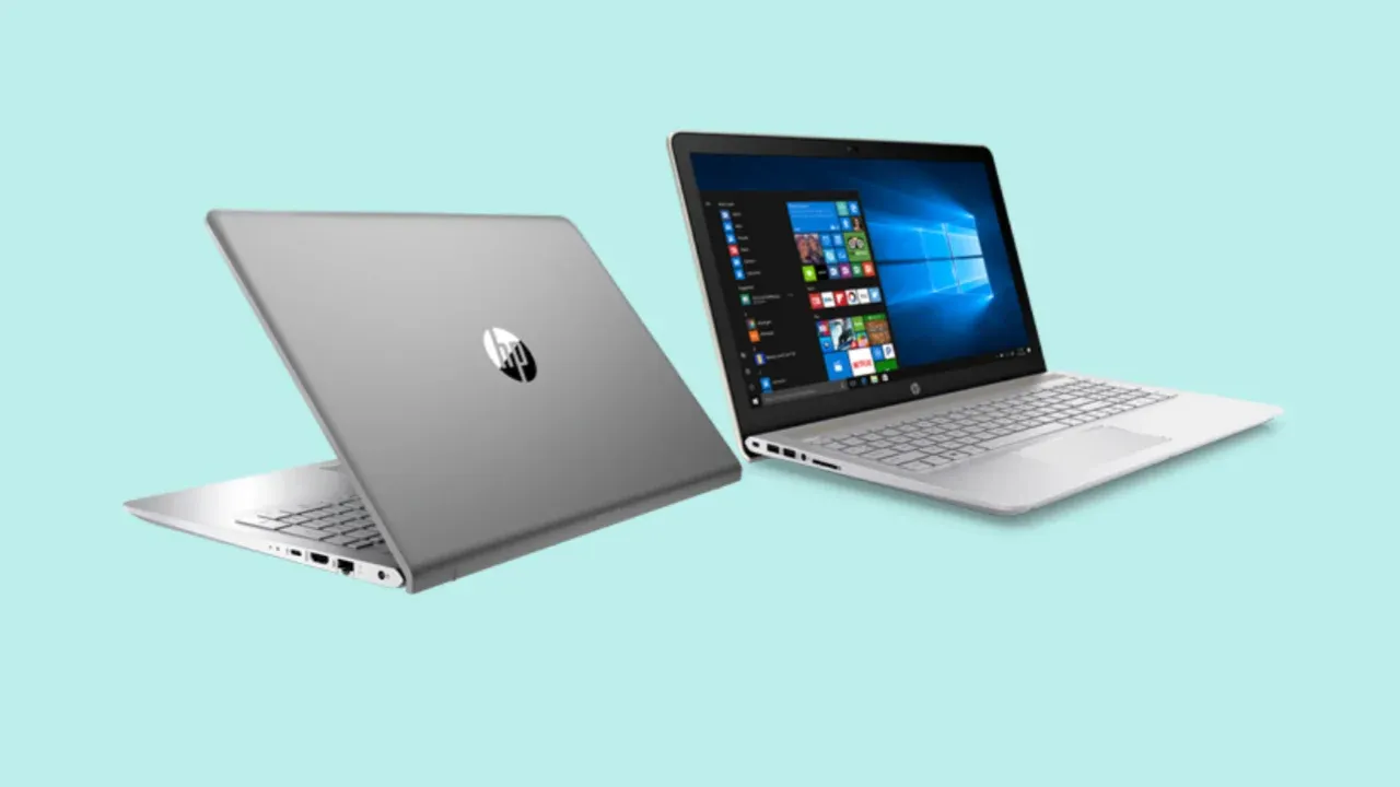
What is in the Box?HP Laptop, 65 W Smart AC power adapter, user manuals
or Shop through your favorite 'Market Place' :
AMD Ryzen 5 5500U (up to 4.0 GHz max boost clock, 8 MB L3 cache, 6 cores, 12 threads)
Live life without limits with a laptop that gets things done. Be more productive and prove your worth when you have the latest AMD Ryzen Processors, up to 16GB Dual channel 3200 DDR4 memory, and AMD Raedon graphics to embraces your switches between games, entertainment, and creative work, so seamlessly. Experience powerful performance and seamless computing for your everyday tasks. That includes improved productivity, smooth streaming, and brilliant Full HD entertainment with immersive, anti-glare display. Also, get a huge performance advantage with SSDs — they’re faster to start up, faster to shut down, and faster to transfer data.
39.6 cm (15.6") diagonal, FHD (1920 x 1080), IPS, micro-edge, BrightView, 250 nits, 45% NTSC
With its superior color ranging capabilities, this laptop ensures stunning display of colors on its FHD IPS display. Ease of access and a completely comfortable design allows you to maximize your machine’s potential. A compact laptop that brings life the visual experience with FHD, and Micro Edge bezel. A laptop with larger screen-to-body ratio, and Micro-edge bezels that maximize your view and make sure that you have crystal clear graphics and also a larger screen to enjoy your favourite videos.
Experience rich and authentic audio through the Bang & Olufsen Play. Each sound enriched to immerse you in a sound that takes you away. Combining it with the Dual HP Speakers & HP Audio Boost, brings to life each note and sound, be it when you’re listening to music or watching a movie.
Worried about your power going down while travelling for long hours? Keep your worries aside and get the HP Pavilion laptop that comes with super-fast battery charging. Enjoy a faster, smoother, and amazingly responsive computing experience that lets you do all your tasks on-the-go without any worries. Built with a battery that smartly adapts to the system demands, you are sure to be offered the best possible performance. HP Adaptive Battery Fast Charges in less time w/ 43WH adapter- 50% in 30 min will allows you to get more hours back in less time.
All New Typography and Writing Formats in the lastest Plus UI v2.6
Please wait until final update.
Most of these features can only be used in 'HTML View' mode, nor can you switch to 'Writing view' mode while using some of these features.
In post editor view, click icon at the bottom right of the title
Two options will appear: HTML view and Writing view
Select 'HTML View'.
Tips: Use <p>Your_paragraph_here</p> tag to add paragraphs to the article.
Writing Format for : Plus UI Themed v2.6 Template Updated on : May 12, 2022
Image with Caption and Auto Lightbox
The caption in this image will not be read in the article description/snippet. You can also choose to keep the captions legible on the article snippets.
All images in the post will automatically have a lightbox function, click this image to try it.
Added class='full' works to remove margin image and screen, only works for mobile view.
Used to hide some images and will be shown when the user clicks the 'Show All' button. Show All function can only be activated once, Images cannot be hidden again when you activate it.
Writing format:
<!--[ Show All Image ]--> <inputclass='inImg hidden'id='for-hideImage'type='checkbox'> <divclass='psImg hdImg'> <imgalt='image_title_here'src='https://4.bp.blogspot.com/.../name.png'/> <imgalt='image_title_here'src='https://4.bp.blogspot.com/.../name.png'/> <imgalt='image_title_here'src='https://4.bp.blogspot.com/.../name.png'/>
<!--[ Button image to activate ]--> <labelfor='for-hideImage'aria-label='Show all image'>Show All</label> </div>
<!--[ Hide the rest image here ]--> <divclass='psImg shImg'> <imgalt='image_title_here'src='https://4.bp.blogspot.com/.../name.png'/> <imgalt='image_title_here'src='https://4.bp.blogspot.com/.../name.png'/> <imgalt='image_title_here'src='https://4.bp.blogspot.com/.../name.png'/> <imgalt='image_title_here'src='https://4.bp.blogspot.com/.../name.png'/> </div> </div>
Image with Scroll Layout
Same as the image layout above, it's just that on the mobile display the images will be arranged in parallel with the additional side scroll function on the mobile display.
We also added a smooth scroll effect to this feature. Please try opening this page on your mobile device:
Useful for delaying loading images so that the blog's PageSpeed score is higher, image will only load when user scrolls to the image area. All images in this article use Lazyload.
You can use this feature to separate paragraphs or to open a new chapter in a post, here's an example of how it looks:
Writing format:
<!--[ To break paragraphs apart ]-->
<hr>
Paragraph with Text Indent
Lorem ipsum dolor sit amet, consectetur adipiscing elit. Proin vestibulum dignissim diam, et efficitur felis commodo et. Mauris vel diam pellentesque lorem lacinia luctus.
Writing format:
<pclass='pIndent'>Your_paragraph_is_here.</p>
Paragraph with Drop cap
Mis a large capital letter used as a decorative element at the beginning of a paragraph or section. The size of the descending limit is usually two or more lines.
The drop cap will resize the first letter of the paragraph so that it drops one or more lines down. Many types of print media use drop caps such as books, magazines, newspapers and so on because they can add to the visual appeal.
Lorem ipsum dolor sit amet, consectetur adipiscing elit. Proin vestibulum dignissim diam, et efficitur felis commodo et. Mauris vel diam pellentesque lorem lacinia luctus.
— Anonymous
Writing format:
<blockquote>Lorem ipsum dolor sit amet, consectetur adipiscing elit. Proin vestibulum dignissim diam, et efficitur felis commodo et. Mauris vel diam pellentesque lorem lacinia luctus.</blockquote>
Another Style:
Lorem ipsum dolor sit amet, consectetur adipiscing elit. Proin vestibulum dignissim diam, et efficitur felis commodo et. Mauris vel diam pellentesque lorem lacinia luctus. Nulla quam magna, pharetra in ultrices at, condimentum id tellus.
Sed suscipit sapien sed turpis ultrices viverra. Ut quis dui sed odio sollicitudin fermentum.
Aliquam vitae metus laoreet, dapibus enim sit amet, feugiat lorem. Sed in dui purus.
Writing Format:
<blockquoteclass='s-1'> <div>Lorem ipsum dolor sit amet, consectetur adipiscing elit. Proin vestibulum dignissim diam, et efficitur felis commodo et. Mauris vel diam pellentesque lorem lacinia luctus. Nulla quam magna, pharetra in ultrices at, condimentum id tellus. <ul> <li>Sed suscipit sapien sed turpis ultrices viverra. Ut quis dui sed odio sollicitudin fermentum.</li> <li>Aliquam vitae metus laoreet, dapibus enim sit amet, feugiat lorem. Sed in dui purus.</li> </ul> </div> </blockquote>
Note Block
This feature serves to add important info, warning sentences or highlight sentences, there are two styles that you can try including:
Lorem ipsum dolor sit amet, consectetur adipiscing elit. Proin vestibulum dignissim diam, et efficitur felis commodo et.
<pclass='note'>Lorem ipsum dolor sit amet, consectetur adipiscing elit. Proin vestibulum dignissim diam, et efficitur felis commodo et.</p>
With Different Colors:
Warning!Mauris vel diam pellentesque lorem lacinia luctus. Nulla quam magna, pharetra in ultrices at, condimentum id tellus. Sed suscipit sapien sed turpis ultrices viverra.
<pclass='note wr'>Mauris vel diam pellentesque lorem lacinia luctus. Nulla quam magna, pharetra in ultrices at, condimentum id tellus. Sed suscipit sapien sed turpis ultrices viverra.</p>
Table
The table in this theme has been set responsive, for example, if the number of columns or the width of the table exceeds the width of the screen, so as not to damage the layout, the table will automatically have a scroll function.
Please open this article on your mobile device and highlight the table section below:
white-space:nowrap; specifies the text to be a single line, it will not wrap to the next line and will continue until <br> tag is encountered.
min-width:100%; defines the minimum width of table, you can change it to px units for example 500px. Change it to 0 if you want the table width to be determined automatically.
Using manual Table of Content is more complicated than the automatic version, you have to add a different ID attribute in each heading tag and write it in content list.
Remove open='' attribute to auto-close Table of Content when the page is first loaded.
You can change the title or phrase 'Show all/Hide all' in the marked section.
Semi Automatic Table of Content
Table of Contents
The easiest option to display Table of Content. This feature will display all heading tags in your post (three levels h2 - h4), so make sure you write heading tags in order. Read: Common Error
Code to specify semi-automatic ToC widget location:
<detailsclass='sp toc'> <summarydata-show='Show all'data-hide='Hide all'>Table of Contents</summary> <divclass='toC'id='autoToc'></div> </details>
Syntax Highlighter
Used to define lines of computer code (HTML, CSS, Javascript, etc.) in posts.
<!--[ Change data-text to .html, .css, .js or any language ]--> <divclass='pre notranslate'data-text='.html'> <prestyle='white-space:pre-wrap; max-height:none;'>Your_code_is_here</pre> </div>
Addition of color code in the syntax can be written manually, but we also provide automatic colored syntax features.
Change data-text='.html' to define another code format, i.e. data-text='.css', data-text='.js', data-text='.php', etc
Value white-space:pre-wrap; useful for disabling side scrolling, long code will be preserved and give a little scrolling function to keep it legible.
max-height:none; defines the maximum height of syntax isn't set (automatic), change the value of none to eg 400px to specify the maximum height of syntax is only 400 pixels.
Use <i class='red'>code_here</i> to add red/orage color.
Use <i class='blue'>code_here</i> to add blue color.
Use <i class='green'>code_here</i> to add green color.
Use <i class='gray'>code_here</i> to add gray color.
Use <i class='block'>code_here</i> to add a block of blue color.
Automatic Colored Syntax Highlighter
Following Syntax is automatically highlighted / colored using Highlight.js
<!--[ <body> open ]--> <body> <p>Sample content here!</p> </body> <!--[ </body> close ]--> </html>
Code to color syntax:
<!--[ Add a classname hl to automatically color syntax ]--> <divclass='pre hl notranslate'data-text='.html'> <prestyle='white-space:pre-wrap; max-height:none;'>Your_code_is_here</pre> </div>
Common Errors:
This feature automatically detect the language and highlight the colors. But in some cases, it may not automatically detect the code language, at that time you have to add a classname as per the language, i.e. if it is html, you have to add html or language-html along with hl.
An Example:
<!--[ Add a classname hl to automatically color syntax ]--> <divclass='pre hl language-javascript notranslate'data-text='.js'> <prestyle='white-space:pre-wrap; max-height:none;'>Your_code_is_here</pre> </div>
Limitations of using Automatic Colored Syntax Highlighter:
You cannot add any tag in your Preformatted Codes. For example, you would add <i class='block'></i>, that is no more going to be blocked with blue color.
The checked attribute defines the first tab that appears by default.
Make sure id='...' and for='...' attributes have the same value. ID must be unique, there cannot be two identical IDs in one page.
Change data-text='HTML' attribute in the highlighted section to rename the tab.
Toggle Show / Hide
Used to create interactive widgets that the user can open and close on demand. By default this widget is closed, will display the content in it when the user presses the command button.
Any content can be included in this widget.
Spoiler:
Epcot is a theme park at Walt Disney World Resort featuring exciting attractions, international pavilions, award-winning fireworks and seasonal special events.
Defines additional content that users can open and close on demand in groups, usually used for a list of questions or FAQs (Frequently Asked Questions).
Accordion_first_title
Epcot is a theme park at Walt Disney World Resort featuring exciting attractions, international pavilions, award-winning fireworks and seasonal special events.
Accordion_second_title
Epcot is a theme park at Walt Disney World Resort featuring exciting attractions, international pavilions, award-winning fireworks and seasonal special events.
Accordion_third_title (alt)
Epcot is a theme park at Walt Disney World Resort featuring exciting attractions, international pavilions, award-winning fireworks and seasonal special events.
Accordion_fourth_title (alt)
Epcot is a theme park at Walt Disney World Resort featuring exciting attractions, international pavilions, award-winning fireworks and seasonal special events.
<divclass='dlBox'> <!--[ Change data-text='...' atribute to add new file type ]--> <spanclass='fT'data-text='zip'></span> <divclass='fN'> <!--[ File name ]--> <span>file_name.zip</span> <spanclass='fS'>200kb</span> </div>
<!--[ Download link (change href='...' atribute to add link download) ]--> <aclass='button'aria-label='Download'href='url_is_here'rel='noreferrer'target='_blank'><iclass='icon dl'></i></a> </div>
With background image instead of text:
about_me.png10kb
<divclass='dlBox'> <!--[ Change data-text='...' atribute to add new file type ]--> <spanclass='fT lazy'data-text='zip'data-style='background-image: url(//3.bp.blogspot.com/.../title.png)'></span> <divclass='fN'> <!--[ File name ]--> <span>about_me.png</span> <spanclass='fS'>10kb</span> </div>
<!--[ Download link (change href='...' atribute to add link download) ]--> <aclass='button'aria-label='Download'href='url_is_here'rel='noreferrer'target='_blank'><iclass='icon dl'></i></a> </div>
Countdown Download Box
This feature will show a countdown before the user downloads any file.
This feature requires direct download link of cloud files. You can use Google Drive to get direct download link of a file.


